
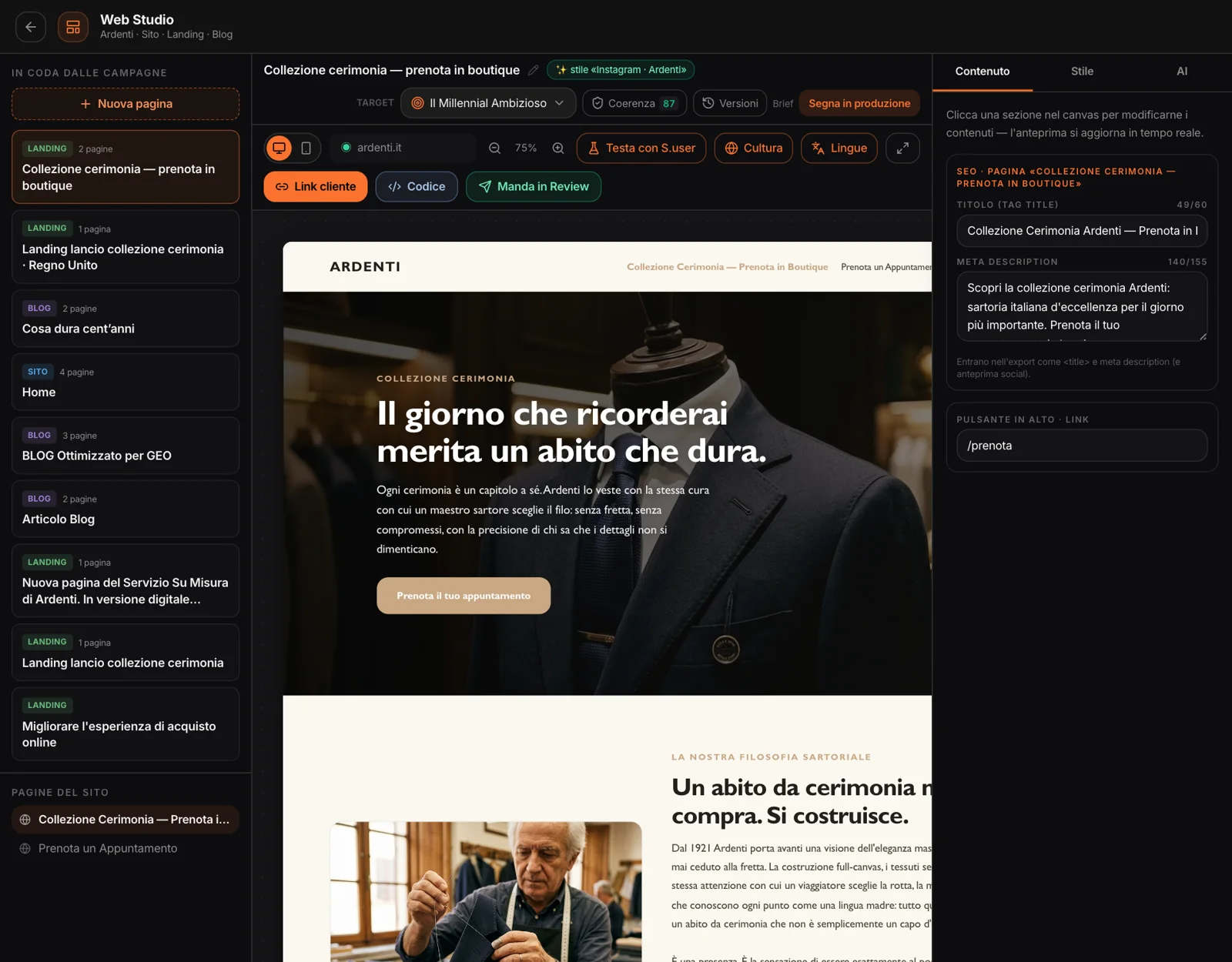
Site, landing page
or blog.
Choose what: a site — with the pages you decide, up to eight —, a landing page, whose sequence of blocks you can compose, or a blog that sets a real article from the Content Studio. Write the brief, attach photos if you have them: the first becomes the opening, the others go into the sections with images.
You can point to the client’s current site: MAPS looks at it and draws out its palette, typeface and mood, so the concept resembles it. Then the style and who we’re talking to. Concepts also come from campaigns, the ABM & Sales Studio, the Strategic Canvas and, for blogs, the Content Studio.
It writes
in the brand’s words.
Every concept starts from what the project already knows.
The brand
The value proposition, message house and voice built in Analyze, with the Brand Kit’s rules, palette, logo and font.
Who we’re talking to
A persona or a segment from the project: the page is written for that audience, its situations and its questions.
The market’s language
It writes in the market’s language; with the B2B profile the register is a business one. The menu and contact form text too.
The current site
If you point to it, the concept picks up its colors, typeface and density: a sibling of the site that exists, not a stranger.
Nothing invented
Products, prices and numbers only from the material. Missing photos are placeholders with a note on what to shoot. Buttons lead to the brand’s real site or to the concept’s pages, never to invented addresses.
Click a section,
change it.
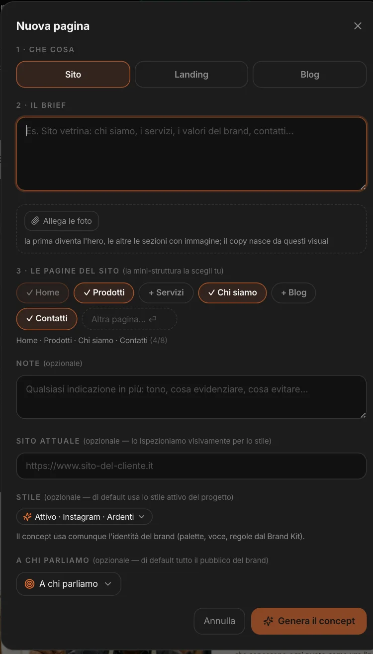
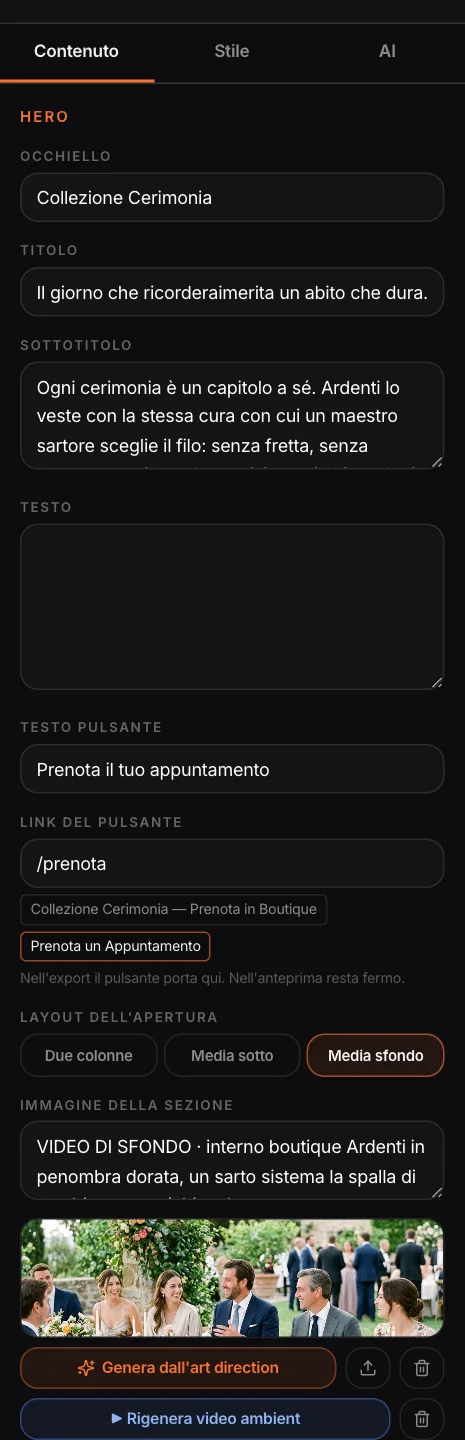
The concept looks the way it would in a browser, on a computer or a phone. Click a section and in the panel you change its text, the button link and, for the opening, the layout: two columns, media below, background media.
Images are generated from the art direction note or uploaded; the opening image can become a short looping video. “Regenerate this section” rewrites it with your instruction — “more direct”, “focus on in-store consultation” — without touching the rest of the page or the images.
The identity,
effortlessly.
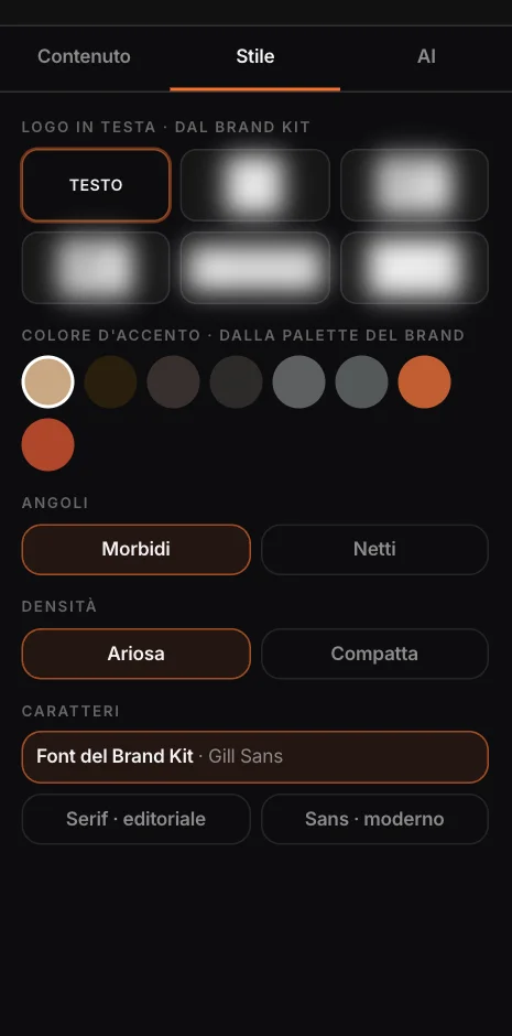
The Brand Kit logo at the top, and in the footer too if you want. The accent color from the brand’s palette. Soft or sharp corners, airy or compact density. For type, the Brand Kit font or an editorial serif or a modern sans.
Ready
for search engines.
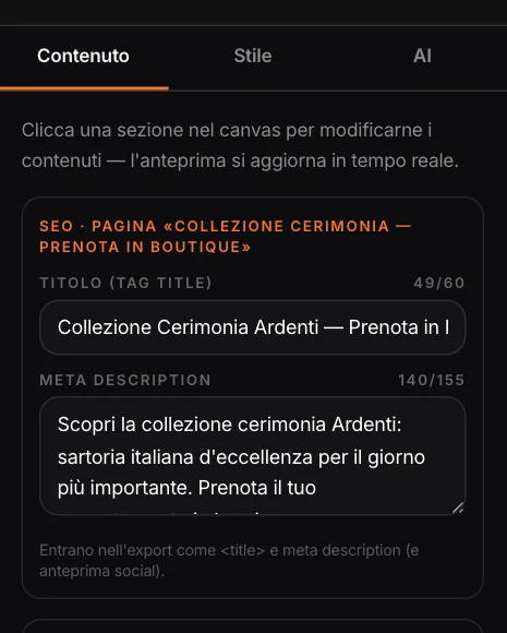
Every page has its own title and meta description, written with the concept in the page’s language and editable with a character counter. In the export they become the page title, the description and the social preview.
Buttons have a real address: the brand’s site or a page of the concept. In the preview they stay put; in the exported code they go where they should.
Ask,
and choose what to apply.
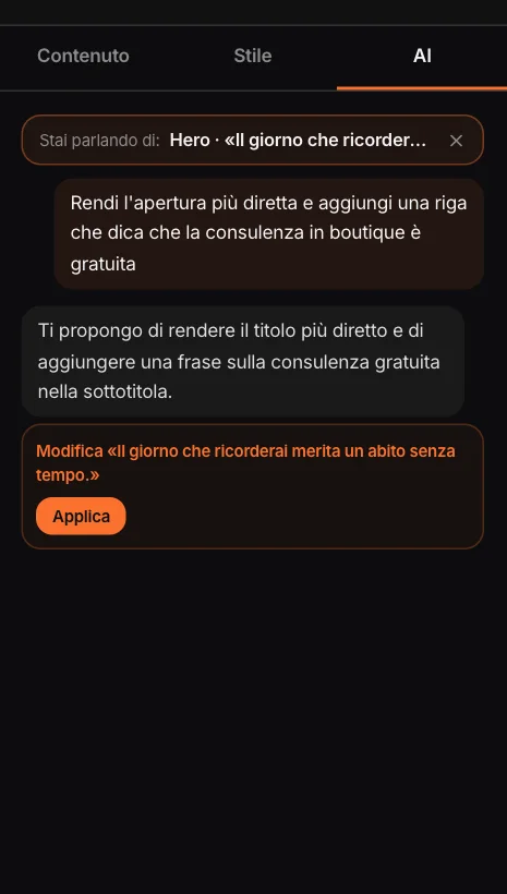
“Make the opening more direct and say the consultation is free”: the copilot answers with proposals — rewrite a section, add or remove one, change the style, suggest an image, move photos and videos — and you apply them, one by one.
If you’ve selected a section, the conversation is about that one. Before every applied change a copy is kept in the versions.
How it will look
to whoever opens it.
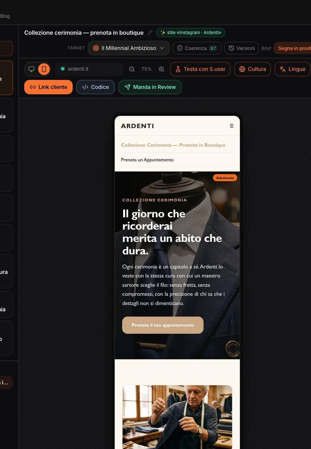
The same page in phone format: the columns stack one below the other, and the ≡ menu opens the site’s pages. It’s the preview you make decisions with, before the code.
Before the client
sees it.
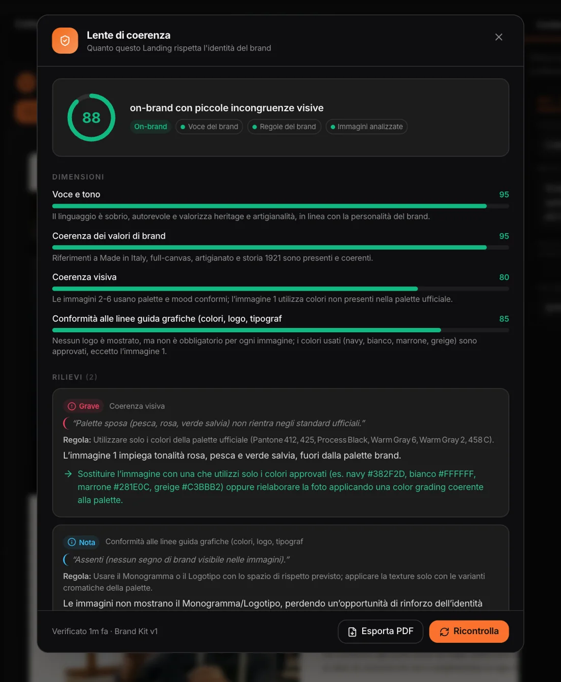
The same checks as the other Studios, on the whole concept.
Consistency
An on-brand score with the dimensions and findings — voice, messages, images, identity rules — and what to change.
Synthetic users
The project’s personas look at the page, copy and photos, and react: score, quote, what they would change.
Culture
How the page lands in the country of the project or of the version; tweaks are applied with MAPS.
Languages
The version for another country: copy, SEO and menu text rewritten for that market; structure and images stay.
Versions
Before every regeneration or copilot edit a copy is kept: restore or delete it in one click.
Status
From brief to published, as in the other Studios: “Mark as published” when the real site is live.
Approved with a link,
delivered in HTML.
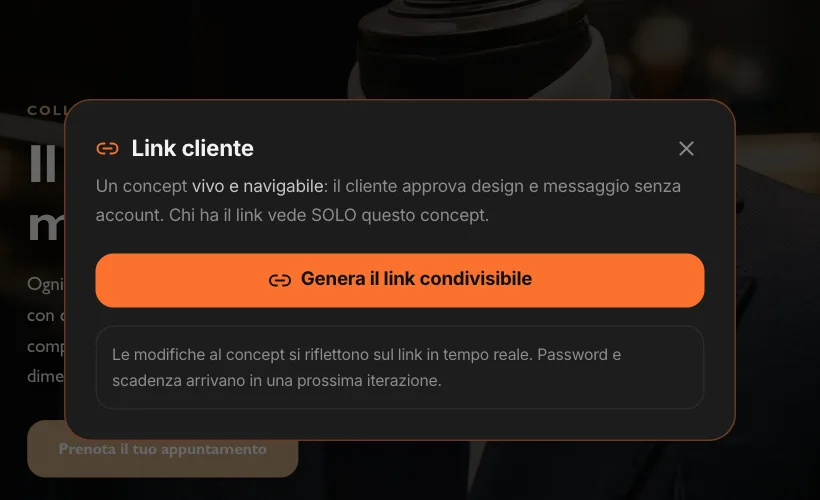
The client link opens the navigable concept, with no account, on a computer or a phone; changes show up right away and you can revoke the link whenever you want. The same concept also reaches the client through Review.
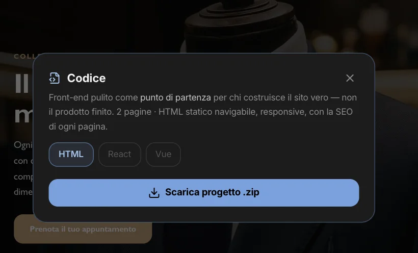
The code is a ZIP of static HTML: one file per page, real links between pages, columns that stack on the phone, the language, title and description of each page. It’s the starting point for whoever builds the real site; React and Vue will come later.
The same HTML,
on a computer and a phone.
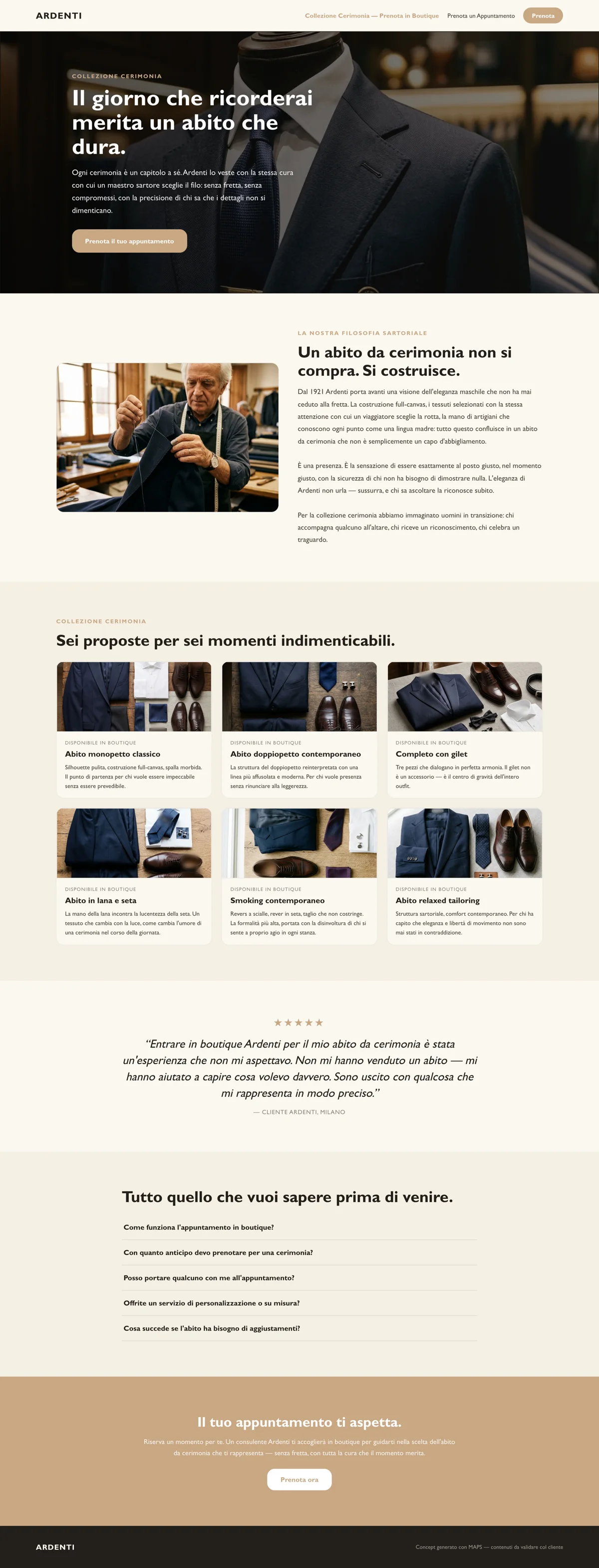
The landing page exported from the Web Studio, opened in a browser.

MAPS prepares the concept; you publish the site, with whoever builds it. And you can ask the project chat “what landing pages have we prepared, and for whom?”: it knows the concepts, the pages, the targets and the statuses.