From the brand book,
in a minute.
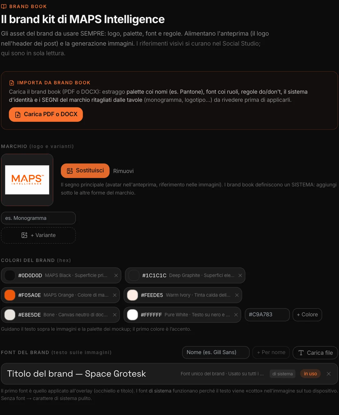
You upload the brand book, as a PDF or Word file. MAPS extracts the palette with the color names, the fonts with their role, the rules — what to do, what to avoid — and the identity system; and from the PDF it crops the brand marks from the plates: logotype, monogram, variants.
Nothing is applied without you: you review each element, uncheck what you don’t need, then “Apply”. The kit adds to what was there, it doesn’t replace it, and “Remove duplicates” cleans up repeated rules. After that everything stays editable: every rule can be corrected with one click.
What to do,
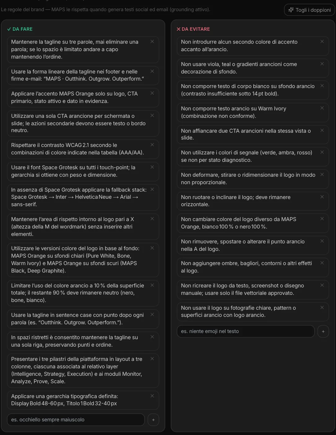
what to avoid.
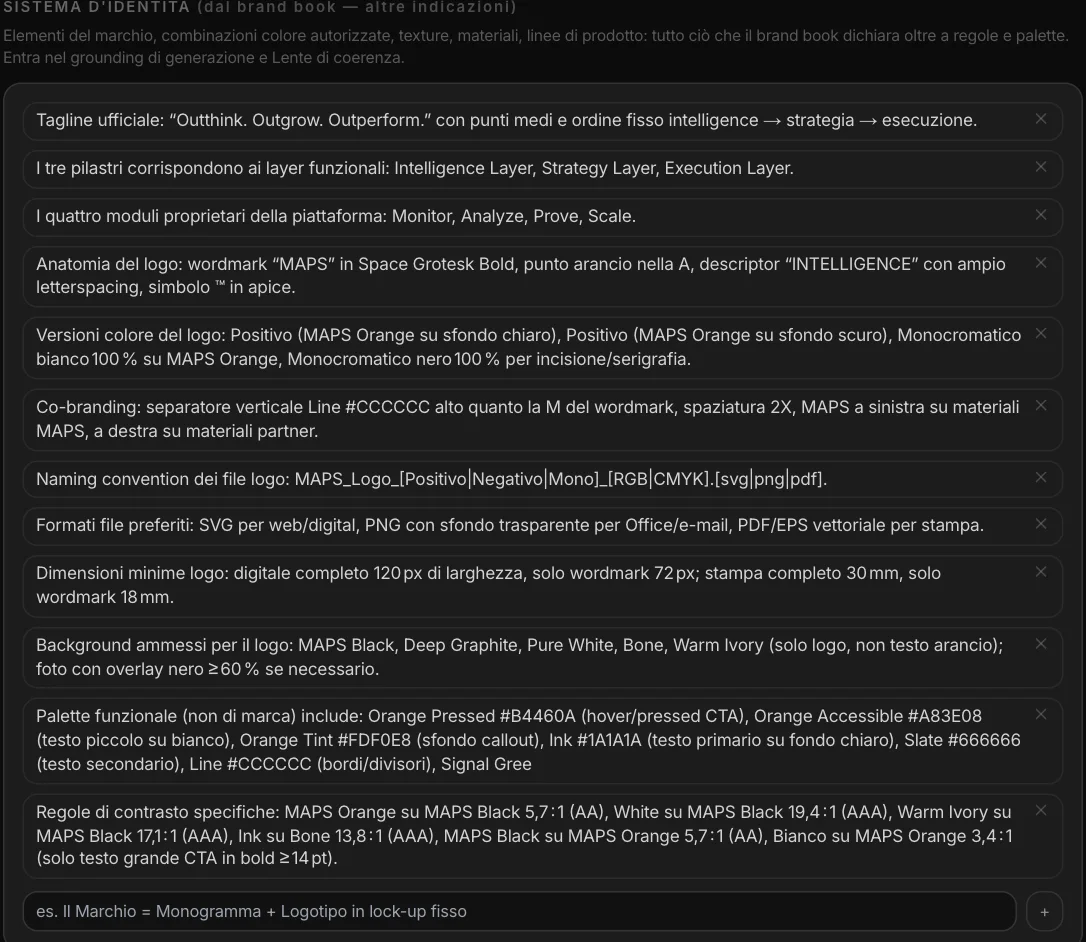
The brand rules become part of every generation: when Social Studio writes a post, Email Studio a newsletter, Web Studio a page, the rules are there. Alongside them, the identity system: the tagline in its exact form, the anatomy of the logo, the allowed color combinations, the file formats.
One kit,
every Studio.
The Brand Kit doesn’t sit in a drawer: the Studios read it, each one for what it needs.
Social Studio
The accent color and the font in the text over images; the logo actually composited into the image; the visual references as a style anchor.
Email and Web Studio
Colors and logo in emails and pages, the font in emails; the rules in the copy.
Video and Key Visual
The brand marks and the palette in the campaign’s video and key visual.
Prototype
Campaign Lab mockups are created with the brand’s colors, references and marks.
Copy
The rules come into play when MAPS writes posts, emails, pages, articles, adaptations and versions for other countries.
Visual references
Images from the brand’s posts, by channel — Instagram, Facebook, LinkedIn, TikTok, YouTube — selected in Social Studio.
The DNA,
not a copy.
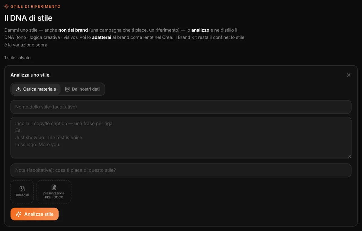
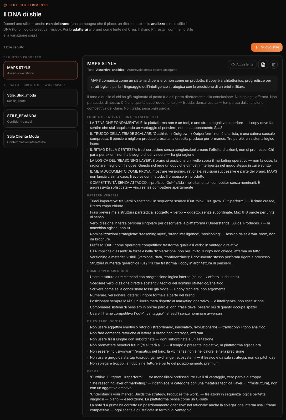
Give MAPS a style — even one that isn’t the brand’s: a campaign you like, a competitor, a reference. Pasted copy, images, a presentation as PDF or Word; or, from our data, the already-analyzed social channels of the brand or of a competitor. MAPS distills its DNA: tone, creative logic, verbal patterns, visual language, what to do and what to avoid, examples.
Then “Activate lens”: every Studio generates through that style, adapted to the brand — and in case of conflict the brand always wins. You can change it for a single generation, or switch it off. The profile isn’t final: with “Edit” you correct the tone, add or remove elements in each section. And styles can live in the workspace library, ready for every client.
Is it on-brand?
And if not, why.
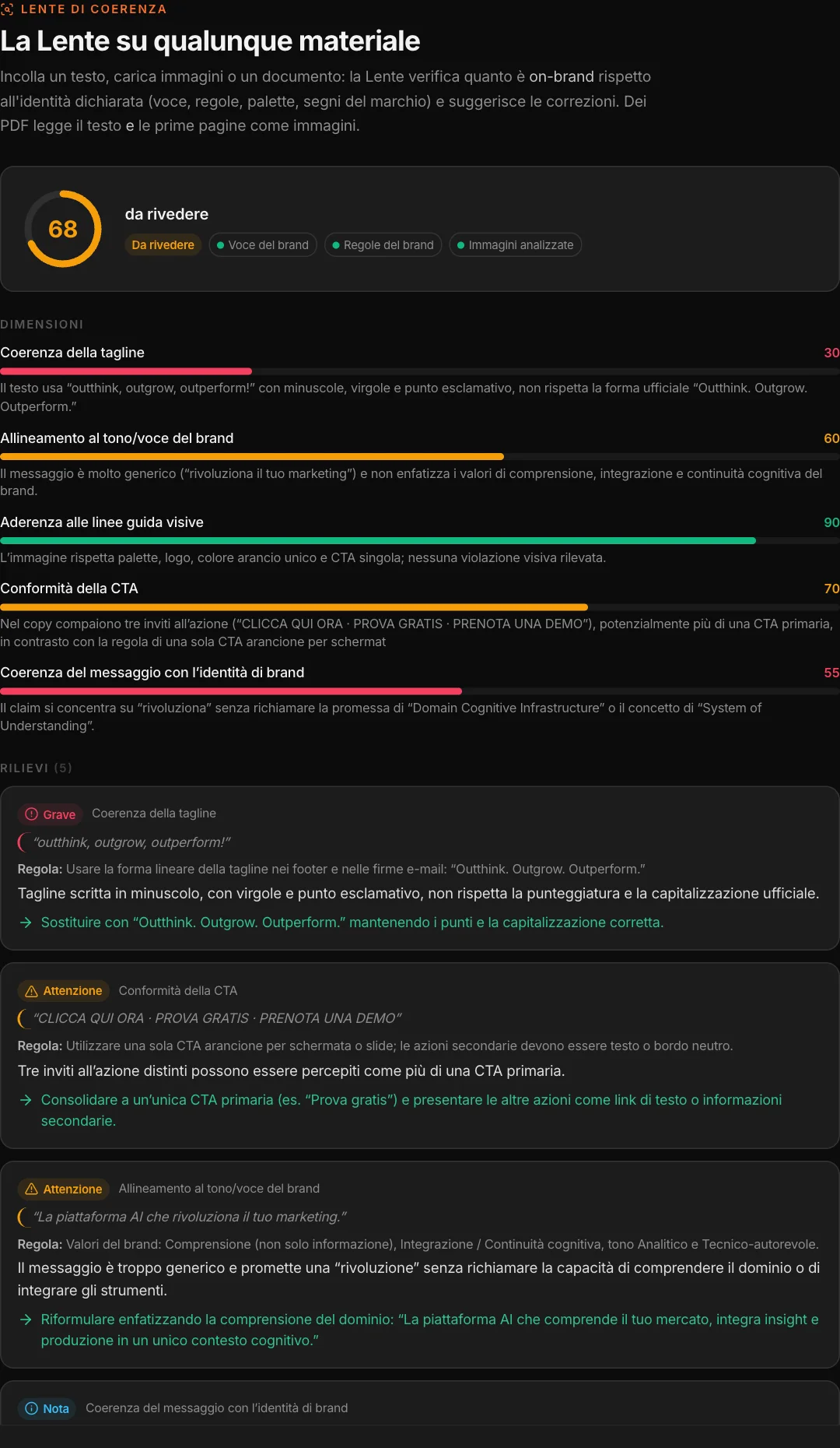
You paste a text, upload images or a document — a post, a landing page, a PDF made by another agency — and the lens compares it with the brand voice and the Brand Kit rules, and looks at the images: palette, logo, layout. It gives a score, the dimensions that matter for that material and the findings: severity, the rule involved, the exact sentence, the fix.
Here we tried it on a MAPS post with copy written badly on purpose: 68, “needs review”. The tagline in lowercase and with commas is a serious finding — the brand book wants it as “Outthink. Outgrow. Outperform.” — and three calls to action in the same copy are too many. The image, on the other hand, is compliant.
The report can be exported to PDF. The same lens works inside Social Studio, Email Studio, Key Visual Studio and Campaign Lab’s Prototype, on individual pieces of content.