
You upload the export.
MAPS does the rest.
An Excel or CSV file from the panel, at market, channel or retailer level. MAPS recognizes the columns on its own — brand, value and volume sales, shares, weighted and numeric distribution, price, promotion, segment — and compares the period with the year before. You choose the company to track; then you add other channels, one by one.
Upload the file
Excel or CSV, just as it comes out of the panel. Nothing to reformat.
MAPS reads it
It recognizes columns, periods, segments; it calculates the comparison with the previous year.
Choose who to track
The company and its brands: the dashboard talks about you, in your market.
Add the channels
Total Italy, specialists, supermarkets, discounters: each channel gets its own reading.

The market, and your place in it
on one screen.
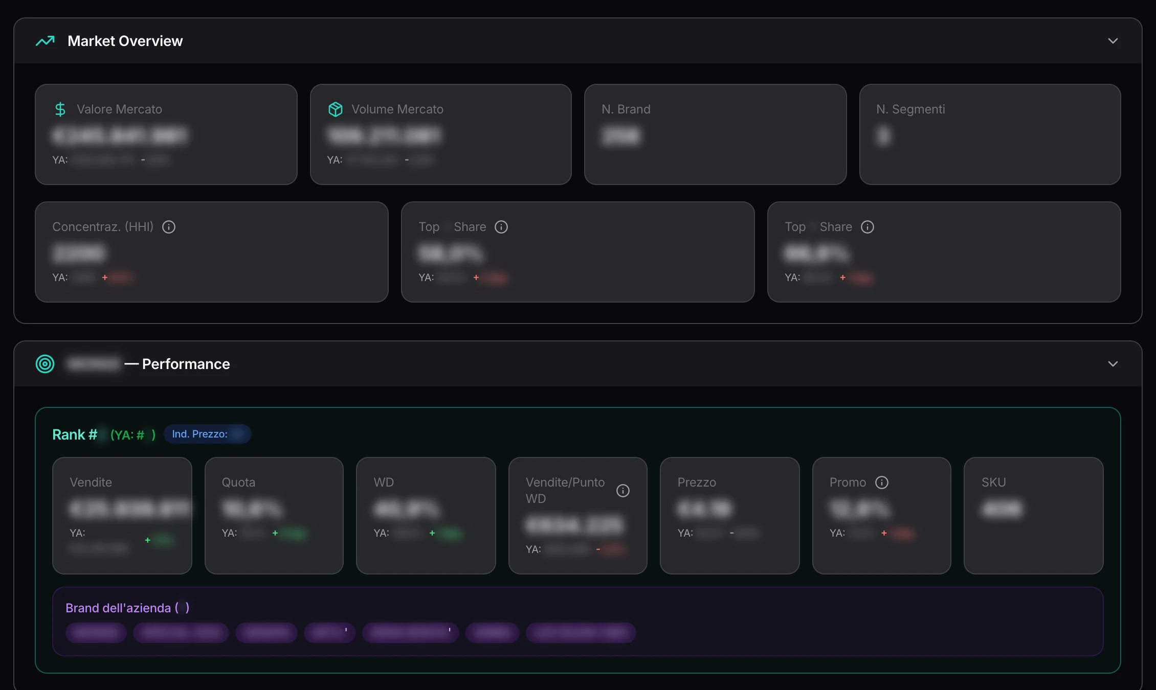
Market value and volume, how many brands and how concentrated it is, the share of the top three and the top five. Then your performance: your rank, sales, share, weighted distribution, sales per store, price, promotion, number of SKUs — each against the year before.
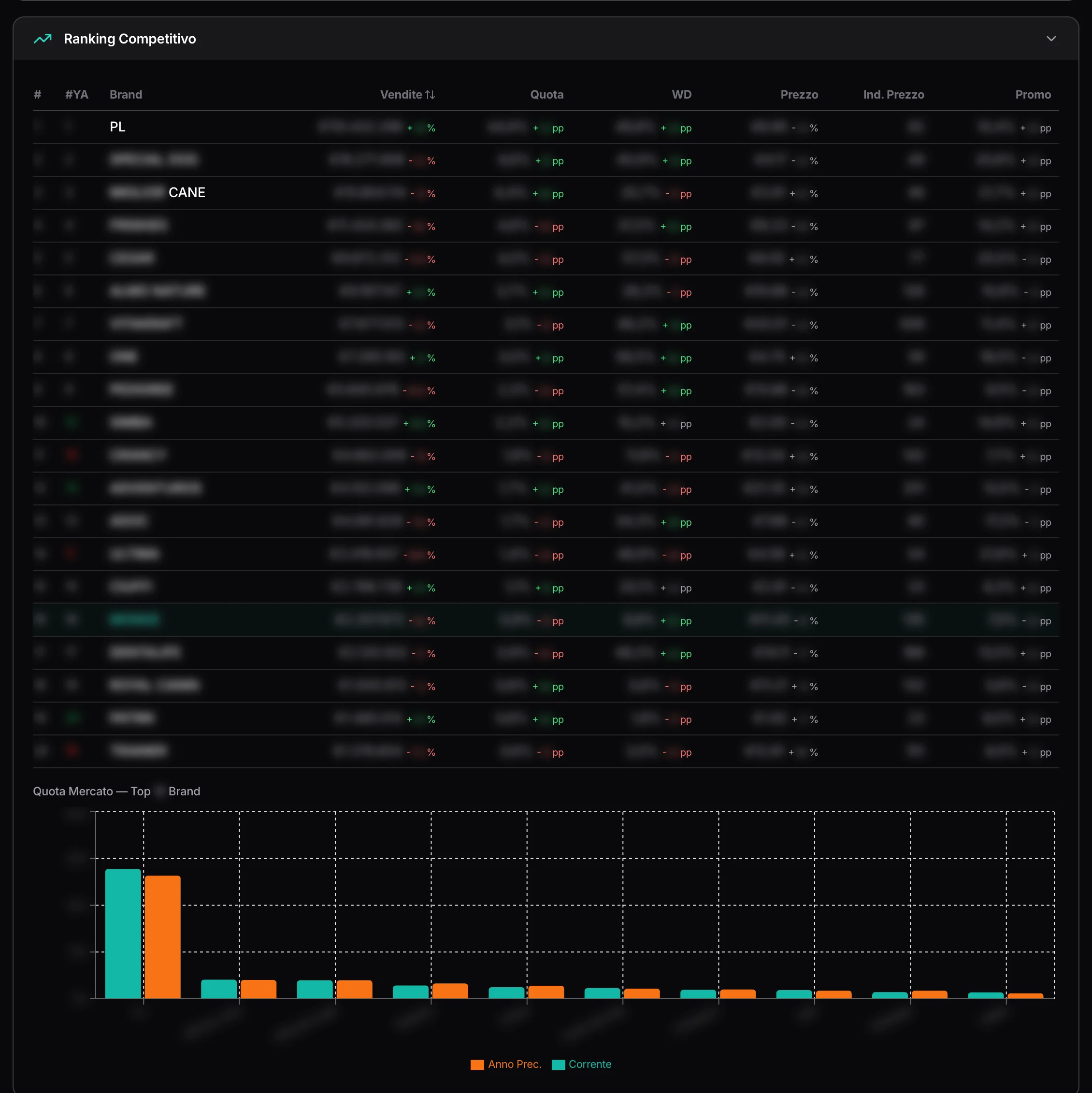
The competitor ranking.
Brand by brand and company by company: sales, share, distribution, price, price index, promotion, and who moved up or down compared with the year before. Then the category segments, one by one.
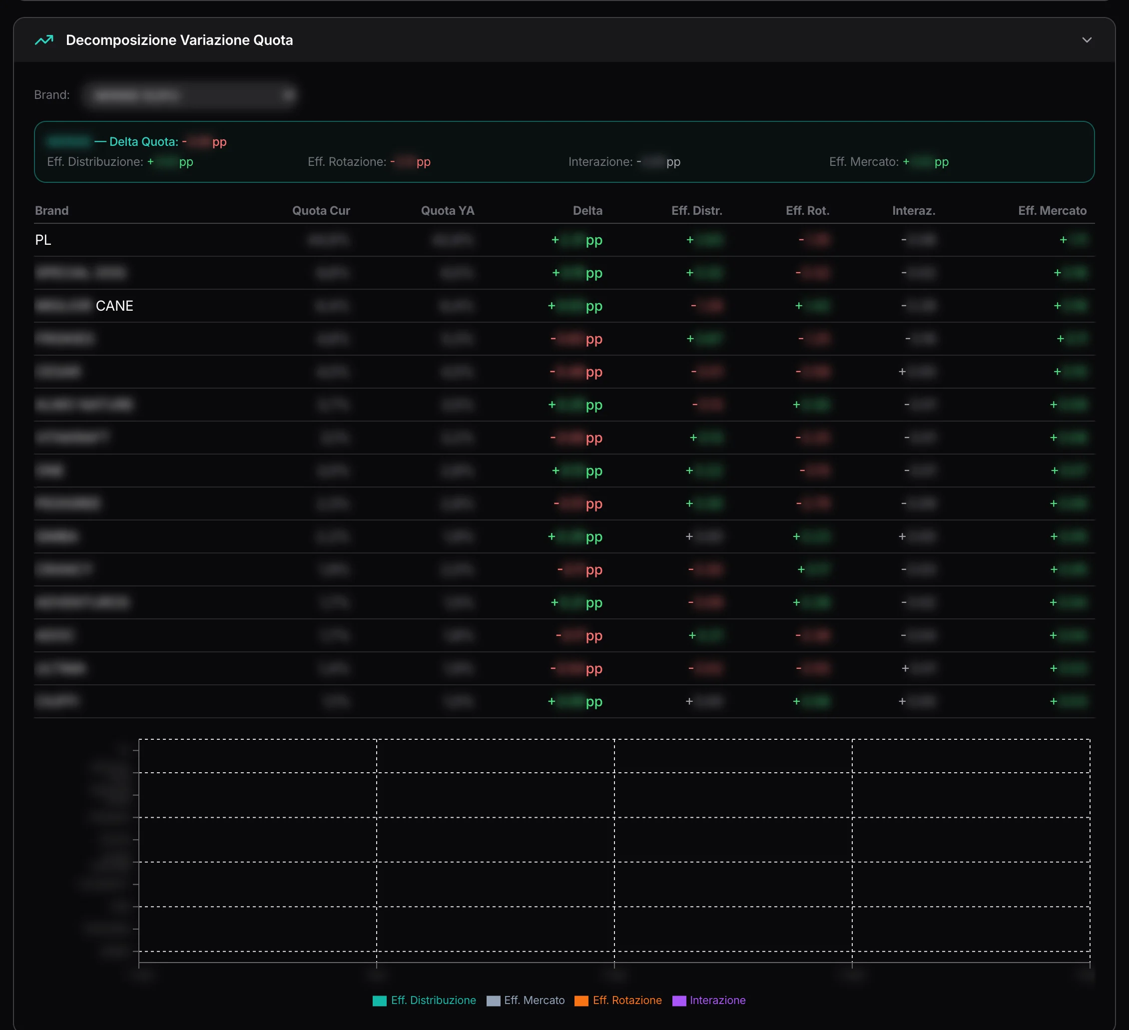
Why share moves.
Driver by driver.
The analyses that usually take an analyst: price tiers, distribution and rate of sale, promotional pressure, SKU-level detail. And the share change decomposition: how much comes from distribution, how much from rate of sale, how much from the market — for every brand. With promotion effectiveness, before and after.
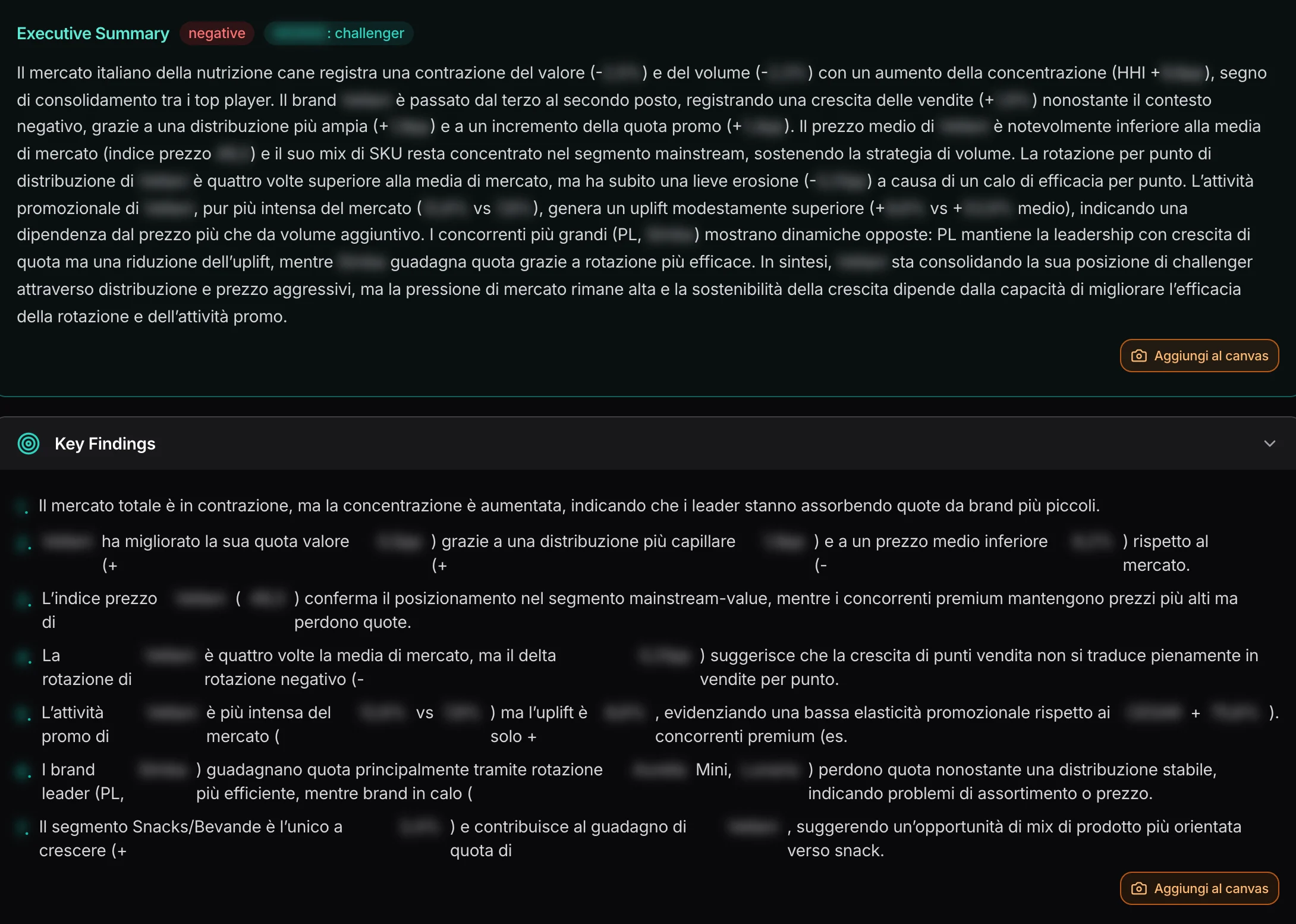
The reading,
written for you.
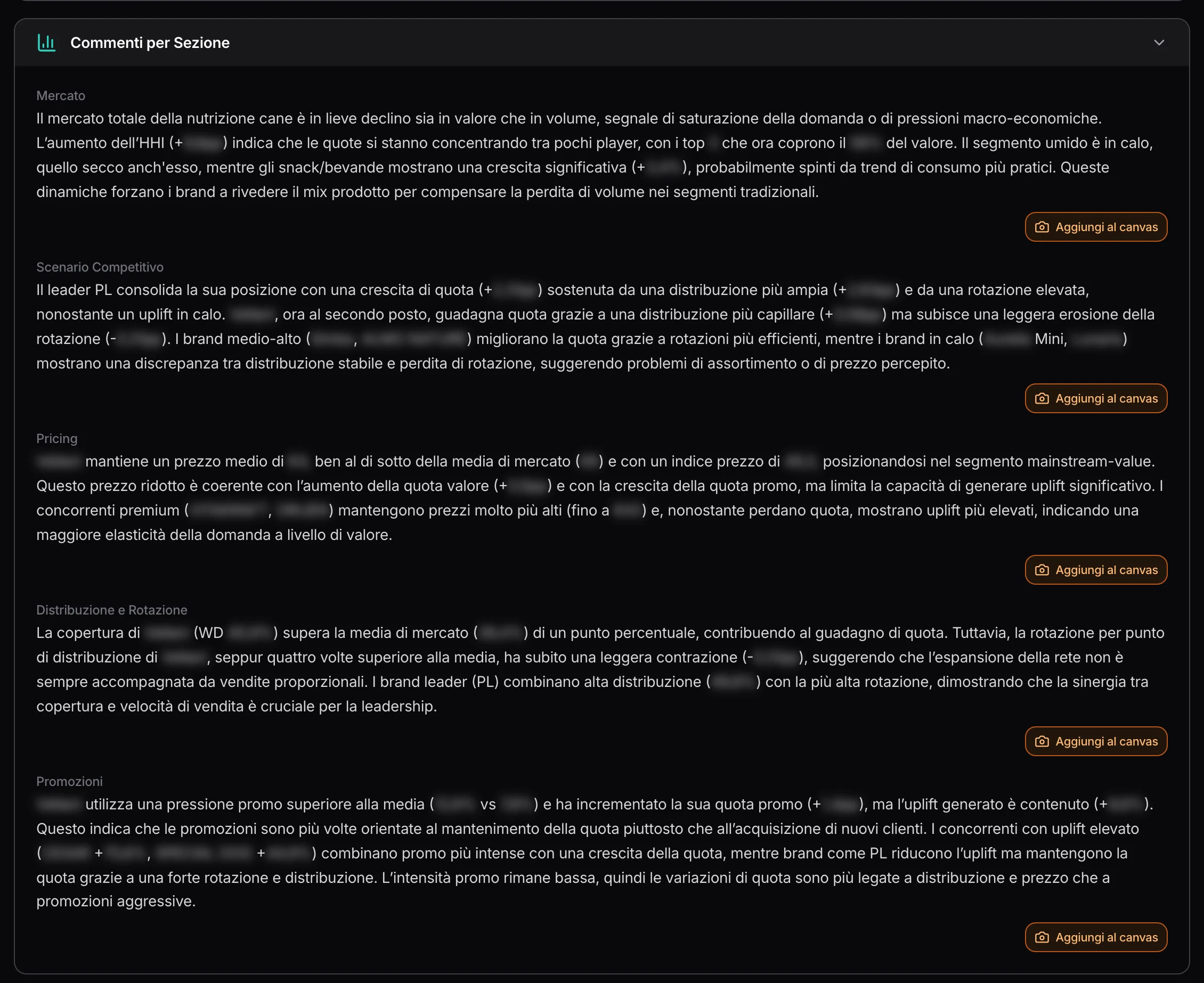
An executive summary — the market, your position, what’s happening —, the key findings, and a commentary for each area: market, competitive landscape, price, distribution and rate of sale, promotions, product mix. Every paragraph goes into the Canvas in one click; the full reading downloads as a PDF.
Ask the question.
The answer does the math.
The question you can’t find in any view, you ask in plain words. The chat turns the question into a calculation on the data and answers with tables and a reading. When the data isn’t enough, it says so — and explains why.
A real conversation.
One question after another, on wet cat food:
At the third question the chat answers that concentration by pack type can’t be calculated: the data doesn’t break down brands within each pack type. It shows what is there, and suggests the alternative.
Every answer goes to PDF or into the Canvas; conversations are saved and can be picked up again.


It doesn’t stay a file.
It becomes part of the project.
In the Canvas
The paragraphs of the reading and the chat’s answers go onto the project canvas, next to everything else.
As a PDF
The full reading and the individual answers, ready to send.
More analyses
A new file, a new period: the analyses stay, side by side.
Consumer projects only
Retail panel data makes sense in consumer goods; in B2B projects the tool isn’t there.